
How it works
Email campaigns in Loyco are edited through a drag-and-drop email editor. Once you open a campaign for editing, you can update all content elements - including text, images, buttons, and layout - directly from the editor without needing any coding knowledge.
Step 1 — Open the campaign overview
Log in to the Loyco Admin Portal and navigate to engage then Campaigns on the top menu. You will see a list of your campaigns with their current status — finished, draft or active.
Step 2 — Open campaign options
Find the campaign you want to edit. Click the options menu on the left side of the campaign row. A dropdown appears with three options:
- Edit campaign — opens the campaign settings and content editor
- Delete campaign — permanently deletes the campaign
- Duplicate campaign — creates a copy of the campaign
Click Edit campaign to proceed. If you are creating a new email, we recommend duplicating an existing campaign and editing from there — it is the fastest way to get started.
Step 3 — Navigate to email content
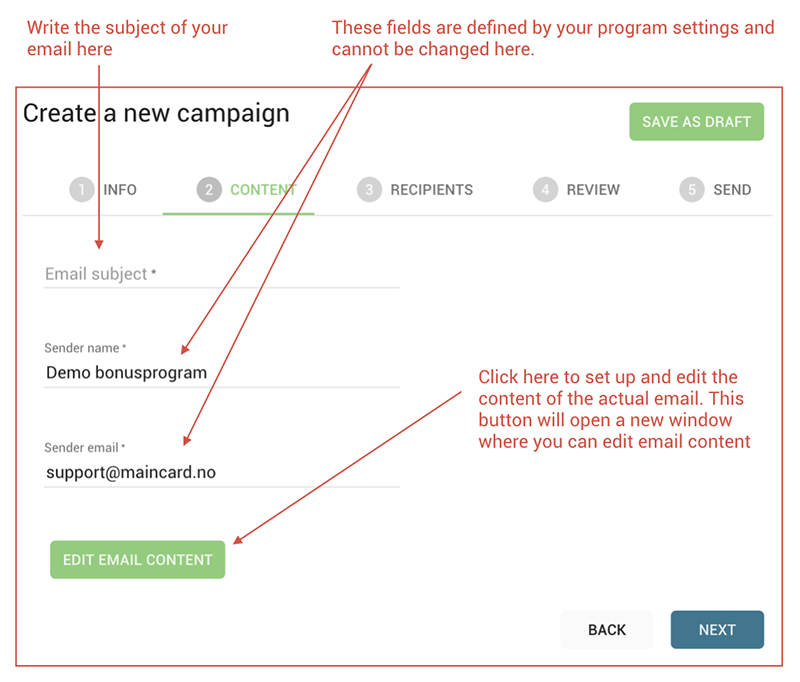
After clicking Edit campaign, you are taken to the campaign settings page. Click Content in the top navigation to open the content section. Then click Edit email content to open the full email editor.help
Step 4 — Edit content in the email editor
The email editor opens with two panels:
- Left panel — a live preview of your email as it will appear to recipients. Any changes you make are reflected here in real time
- Right panel — the editing toolbar with three tabs: Content, Rows, and Settings
Content tab
The Content tab contains all the building blocks you can add to your email. Drag any element from the right panel and drop it into the desired position in the email preview on the left. The available content elements are:
- Title — add a heading or section title
- Paragraph — add a block of body text
- List — add a bulleted or numbered list
- Image — upload or link an image
- Button — add a clickable call-to-action button
- Table — insert a structured table
- Divider — add a horizontal line to separate sections
- Spacer — add vertical spacing between elements
- Social — add social media icons with links
- HTML — insert custom HTML code
- Video — embed a video
- Icons — add icon elements
- Menu — add a navigation menu to the email
- Text — add a personalised text block
- Stickers — add animated or static stickers to your email
- GIFs — add animated GIFs directly from the editor
Rows tab
The Rows tab lets you manage the layout structure of your email. When you click on a row in the email preview, the right panel switches to Row Properties with three sections:
Backgrounds
- Row background color — sets the background colour for the full width of the row
- Content area background color — sets the background colour for the content area inside the row
- Row background image — toggle on to add a background image to the row
Borders
- Content area border — toggle on to add a border around the content area. Choose border style, width, and colour. Toggle More options to set different values for each side individually
- Content area rounded corners — toggle on to add rounded corners to the content area. Set the corner radius using the + and - buttons
Layout
- Content Area Padding — controls the spacing inside the content area. Use the + and - buttons to adjust. Toggle More options to set different padding values for each side individually
- Vertical align — choose how content is aligned vertically within the row: top, middle, or bottom
- Stack on mobile — toggle ON or OFF to control whether columns stack vertically on mobile screens
- Stack order on mobile — choose the order in which stacked columns appear on mobile
- Hide on — choose whether the row is hidden on all devices, desktop only, or mobile only
Cards Style
- Spacing — controls the spacing between cards within the row
- Cards rounded corners — toggle on to add rounded corners to cards within the row
Settings tab
The Settings tab contains global design settings that apply to the entire email rather than individual elements.
Design Settings
- Content area width — use the slider to set the width of the email content area. The default is 675px
- Content area alignment — choose between Left or Center alignment for the content area
- Background color — sets the background colour for the full email canvas. Default is white (
#ffffff) - Content area background color — sets the background colour for the content area. Default is transparent
- Background image — toggle on to add a background image to the full email canvas
- Default font — sets the default font used throughout the email. Default is Arial
- Link color — sets the colour of all hyperlinks in the email
Step 5 — Save your changes
Once you are happy with your edits, click Save in the email editor to save your content changes. You are then taken back to the campaign settings page. Click Save as draft to save the full campaign as a draft.
Your updates are saved to the campaign draft and will not be sent to recipients until the campaign is activated.
Good to know
Editing text and adding merge tags
When you click on a text element in the email preview on the left, a formatting toolbar appears above the selected text. This toolbar lets you format your text and insert personalised content directly inline.

Merge tags
Click Merge tags to insert personalised variables that are automatically replaced with the recipient's actual data when the email is sent. Common merge tags include:
- fname — inserts the recipient's first name
- releaseablebonus — inserts the recipient's available bonus balance
Using merge tags makes your emails feel personal and relevant to each recipient without having to write individual emails manually.